Showing posts with label Series- -Accessorize your walls. Show all posts

Monday, January 18, 2010

Accessorizing Your Walls - Bookshelves

House Beautiful Photo Robert Trachtenberg

Happy Monday everyone! Hope you all had a good weekend. It was warm and sunny here in Minnesota (in the 30's) and I loved it.

Bookshelves can be a great way to fill a blank wall, and, depending on your budget, they don't need to be expensive. (First let me get off track a little by noticing the layered rugs in the first photo and the way that they've hung the mirror on the front of the bookshelves. I like...)

See the large blank wall in the before photo of this room below?

BEFORE

In the after photo you can see that they've filled the wall with IKEA bookcases. Painting the backs out in a contrasting color really makes a dramatic statement, and they've decided to hang some artwork on the front of the shelves as well, which again, I love!

AFTER

Canadian House and Home Photo Angus Fergusson/Courtesy of HGTVs Style Dept.

Another colorful, slightly different version of the same idea.

Southern Living via myhomeideas.com Photo Van Chaplin

These aren't bookshelves obviously, but I thought the way they used this plate rack to display photos was interesting.

Southern Living Photo Charles Walton IV

BHG.com's Hardworking Storage Solutions in Charming Displays shows you some different bookshelf ideas...


These bookshelves help make this a unique and interesting staircase...
Coastal Living via myhomesideas.com Photo Roger Davies

You may not want to fill your entire wall with these, but I love Martha's idea for making bookshelves out of benches...
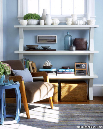
marthastewart.com

Do you have a blank wall where you could use a bookshelf?

Thursday, January 7, 2010

Accessorizing Your Walls - Curtains

Amanda Nisbet Design

WARNING!
THIS POST REQUIRES IMAGINATION AND VISUALIZATION

My intention was to find more examples of this for you - NO luck - or to make up some examples but that didn't happen either. Soooo... You'll just have to use your imagination and try to visualize the concept.

I'm definitely not advocating that everyone start slapping curtains on every wall that doesn't have windows, but I think it can be a great idea for certain spaces. For example: Look at the image above and imagine instead that this is a large windowless dining room wall that's been driving you crazy. The walls are painted in your favorite color and the curtains have been changed to ones that work with your color scheme (high contrast with the wall if you want them to stand out - neutral or close to the wall color if you want them to blend and just provide softness and texture). The console table here has been swapped out for a buffet. Are you getting the picture? Am I crazy? :-)

Can you think of anywhere else you might use a wall curtain, or is the idea just not for you?

Wednesday, January 6, 2010

Accessorizing Your Walls - Project It!

You can definitely eye-roll on this one, because I should have expanded more on this in yesterday's post rather than doing another post on it today. I told you that the first image in that post had been projected on the wall using an overhead projector and traced with chalk. This may have already occurred to you, but I thought I'd do a quick post to point out that this method can also be used with paint.

Just a Girl created this adorable tree mural for her daughters room using an overhead projector and transparency. There's a complete tutorial on her site.


This overhead projector method isn't limited to art for children's rooms. I don't have a photo of it, but years ago I helped decorate a small church that was looking for something to fill the blank wall behind the pulpit. I chose a pretty font and typed up a scripture in Microsoft Word and then printed it out on a transparency using my ink jet printer. Projected the words on the wall using an old overhead projector that the church had, traced it with a paint pen and then just colored it in (with the same paint pen). It was SO simple and, because I didn't do it freehand (which would have been a disaster), it looked professionally done. You can use this method for any room in your house, using any image or font that appeals to you that can be printed on a transparency, from simple to complicated. I used the church's overhead projector, but you should be able to rent one locally or maybe you could borrow one from a library, church or school.


Speaking of cute rooms with trees, I just had to share this cute nursery that Design Dazzle featured where they not only painted a tree on the wall, but gave it more dimension by taping fake peonies to the tree with double sided tape.


Linking to Works for Me Wednesday at We Are That Family.

Monday, November 23, 2009

Accessorizing Your Walls - Solving The Small Art Issue

Pottery Barn

So if your art is too small, you really love it and don't want to change it, what do you do? Well... you could use some of these tricks to make it feel larger than it really is. Give it presence, for lack of a better word. As with all of the ideas I present on this blog, I would encourage you to think past the exact replication of what's in the photo or the style, if it's not yours, and think about how you could modify the IDEA to suit your own decor.

Add molding. See how much more dramatic of a focal point this mirror becomes just by adding the simple molding around it?

house and home

We've talked about the color block idea, and as you know, I'm a fan for a variety of reasons. I'm not going to repeat this entire post (there are two more examples here and here), but two of the reasons are - it's an inexpensive way to make a big statement and there are a bajillion variations on the theme - limited only by your imagination.

Thrifty Decor Chick used the color block idea combined with molding above her sofa. Picture this as well with the color block and only the outer molding with a picture and two sconces centered in it OR three vertical pieces of art OR plates OR three vertical color blocks framed with molding OR... the list goes on.

Diyideas.com has this clever "constant canvas" for rotating children's art. This fabric covered plywood idea could be used for any type of art and could obviously be enlarged if you have a larger space to fill. Go to their site to see how they do it and how they also add dimension with brackets.

DIYideas.com

Very simple idea below that, again, could be modified to suit your needs. The larger one or both could just be paint or wallpaper too, wouldn't have to be covered canvas. You could also add a third dimension by hanging something on the smaller canvas (art, sconces, mirror, etc.)

BHG.com Photo Greg Scheidemann

Love how this little chest below actually becomes part of the art with the addition of this fabric trimmed with molding. Again, think of the possibilities to suit your space and decorating style.

House and Home Photo Angus McRitchie

Could you imitate this idea below and just hang a larger frame over your existing art?

DIYideas.com

Variation on the idea above. Could you hang your art over a larger mirror? I just put this together in Power Point, but you get the idea.

Mirror - Pottery Barn Art - Ballard Design


Donna from Funky Junk Interiors wasn't trying to make this clock appear bigger, she wanted to hide the cord :-) (and it worked!), but this is a great example of adding some sort of structure behind your art to make it larger. This idea could work for any style from country to modern, depending on the items that you use.

Funky Junk Interiors

Think of ways that you could modify these ideas to suit your own decor. Let me know what you come up with! I would love to see it!

Don't forget to enter the $35 Amazon Gift Card GIVEAWAY!

Friday, November 20, 2009

Accessorizing Your Walls - DIY Art Ideas

Well, yesterday you learned that I have a short attention span, and today you're learning that I just can't be relied upon! I said that my next post would be ways to make small art bigger (which WILL happen) and instead I'm showcasing some DIY art inspiration. What I'm learning - don't broadcast what you're doing in advance, just do it when you do it and then you won't feel the need to apologize! :-) Honestly? I took the day "off" today to get a bunch of baking and some other things done for the out of town company I'm expecting for 4 days next week and this post just went together more quickly than the other ones.

Click on the sources for more information on the project.

Wallpaper Art

Southern Living Photo Laurey W. Glenn

Word Art

Myst33 via DIY Showoff


Frosted Monogram Mirror

The DIY Showoff

Magnetic Chalkboard Mirror

Viva Full House via Design Sponge


Wine Crate Display Cases

via Design Sponge

Gold Chevron Paintings

Make Under My Life


$60 Pottery Barn Knock-off Mirror

Starter Home To Dream Home

This design was made using a rubber doormat!

Frugal Home Ideas

Ceiling Medallion Art

BHG.com

Don't forget to enter the $35 Amazon Gift Card GIVEAWAY! Have an awesome day!

Thursday, November 19, 2009

Accessorizing Your Walls - Bringing It Together

BHG.com

Random art placement… A little wreath here, a little picture there, a little shelf on the next wall, all sort of randomly placed. We've all seen it and I think we’ve probably all done it at one point or another in our lives. Sometimes it happens because we may not know another way to do it, but in some cases there is also a perception that every wall has to have something on it and we don’t have enough accessories, so just scattering it around so there’s a little something everywhere seems the obvious choice.

Just to ease your mind and help you make more effective use of your art - Every wall does not have to be filled. In fact, it’s better if they’re not all full because the eye needs a place to rest in the room too.

Walls less than 3 feet wide really don’t need to be accessorized. Not saying that they can’t be, just saying it’s not necessary, so maybe you could use the art from that wall to help towards more effectively accessorizing a larger wall.

via House of Turquoise Photographer Eric Roth

In this Fireplace Accessorizing - Using What You Have post, we talked about choosing a spot to accessorize and completing it before moving on to anything else, even if it means stealing from other areas and leaving them bare. I still think that’s the way to go. It will look much better to have one spot completely accessorized (correctly) than many walls a fraction done.

We’ve talked before in this post about repeating items to make a dramatic statement (just an aside here – if you have a set or group of art it’s always much more effective to keep it together than breaking up the set throughout the house) . You can also use this same idea of grouping to pull together a variety of things you have scattered on walls throughout the house. I've seen items like those in the photo below placed randomly, separately on walls. How much more effective to pull them together in a grouping as they did above this buffet.

Country Living Photo Michael Luppino


To help you more effectively organize and hang your groupings or any other art, here are some resources.

How To Easily Hang a Collection of Art Pieces On The First Try by Southern Living


Hanging Art: Tips From Experts from BHG.com

Hanging Art Tips from Stellers Gallery


Tracy did a post on hanging collections here.

How to Securely Hang Heavy Objects at doityourself.com

Hanging Heavy Objects From Walls at BHG.com

There's been a fair amount of blog buzz about these invisible plate hangers at DISChangers.com.

I haven't used these before but Blair mentioned them in a comment recently so I thought I would include them so you can check them out. MonkeyHook Heavy Duty Wall Hanger.

I know that some of you have art that is just too small and you're wishing it were larger. In the next post, we'll talk about some possiblities to help you with that problem.

Have a great day!

Wednesday, November 18, 2009

Accessorizing Your Walls - Scale

BHG.com
Explaining scale is difficult for me because, like so much of accessorizing, it's a visual thing for me. My eye tells me if something is right or not, and I've been told (more than once) that I'm pickier than most about it. To avoid imposing my personal opinions on you and making you paranoid (and because I can't really explain it) I'll keep my comments brief. I will say that it seems like many people tend to go too small rather than too large. We'll get more into some of that in the next post.

BHG.com Photo Veronica Toney

The summary of what I was taught about scale? "An object is in scale when it's size is harmonious with the size of the objects and space around it". I'm sure you find that extremely (not) helpful. :-)

BHG.com

In the photo below there were different options that could have been used (for example: this art would not have to be this big and could have been something horizontal, versus vertical) but this works well to make a dramatic statement/focal point in this room. I really hesitate to say this because the idea could really be misused, but I would rather see people go too large in their artwork than too small.
Country Living Photo Laura Moss

As far as measurements you can use, the advice I gave here should help some, but a guideline I've heard for filling a large blank wall without furniture is 2/3 the width.

In the next post we'll talk about NOT randomly accessorizing your walls.

Opinions, experience, advice on today's post?

Have an awesome day!

Monday, November 16, 2009

Accessorizing Your Walls - Crunching Some Numbers

myhomeideas.com

In all of the homes I’ve visited in my life, very seldom have I seen art that’s hung too low, but I’ve seen a lot that’s too high. I’m tall, so eye level for me is a smidge over 67”, and I’ve seen a fair amount of art hung above my eye level by a ways. So I'm sure you can guess what the next tip is...

#2: Don't hang your art too high - In general, if you put the center of your art, mirror or grouping somewhere around 60" high it should work out pretty well. Some of you have probably heard advice to hang it at eye level, but since that is quite variable, around 60" is a good average height. If the art is in a room where you're seated most of the time, that number can be fudged down even more.

myhomeideas.com

When you're hanging art above furniture, you want it to relate to what is below so approximately 6" or so above the furniture is a good rule of thumb.
Southern Living Photo Charles Walton IV

#3: Art or groupings that aren't wide enough may end up looking a little lost on the wall. If you're looking for a guideline that you can use for width above furniture, shooting for at least 2/3 - 3/4 of the furniture width will work. This can vary above buffets, etc. where lamps and accessories fill in the gaps.

Country Living Michael Luppino

These guidelines should help you avoid art that's just floating in the room as if it doesn't belong, and a space that feels slightly disjointed.

If your space is feeling a little out of sorts, maybe the solution is as simple as moving your wall art/mirror/grouping down a little? If you try it and it works for you, I would love to hear about it!

EDIT: Hooking up to Julia's HOOKED ON HOUSES link party - check it out!

Sunday, November 15, 2009

Accessorizing Your Walls - Work With the Shape of the Space


As I was working on this, I realized that one post could turn out to be very long and possibly a little overwhelming so I decided to break it up. Tuesday's post will NOT be about accessorizing your walls but, other than that, I'll do as many posts in a row as I need to say what I want to say about the topic. I guess some would call that a series :-)...

You've also probably seen all kinds of room photos from designers that have not followed some of these guidelines (I've probably shown some of them on this blog), but we're not going to go there. What I'm sharing with you are very basic in-the-box principles that aren't new, but some that I've learned and used successfully that will help you to get it right without guesswork, or necessarily having to have an "eye" for design or art placement.

#1 - Follow and work within the general shape of the space you're accessorizing.

For example, I typically view the space above a sofa as a large rectangle. With that in mind, these first two don't work...
(the first one may seem extreme, but I've seen it many times - random art placement - we'll cover this in another post in this "series")


While these two definitely do...


So before you accessorize your wall, analyze the shape of the space first... What is it? A square? Rectangle? Triangle? Once you've analyzed the space there are a bajillion (not a word, but I like it) ideas for what you can put IN the space and how you can arrange it and still be within the basic framework, but defining it is step one.

Since my examples don't really have much of a pretty factor, I thought I would end with this bedroom by Phoebe Howard which also demonstrates art fitting, not fighting, the space.